
Brand refresh for Delmon Readymix & Precast.


THE BRIEF
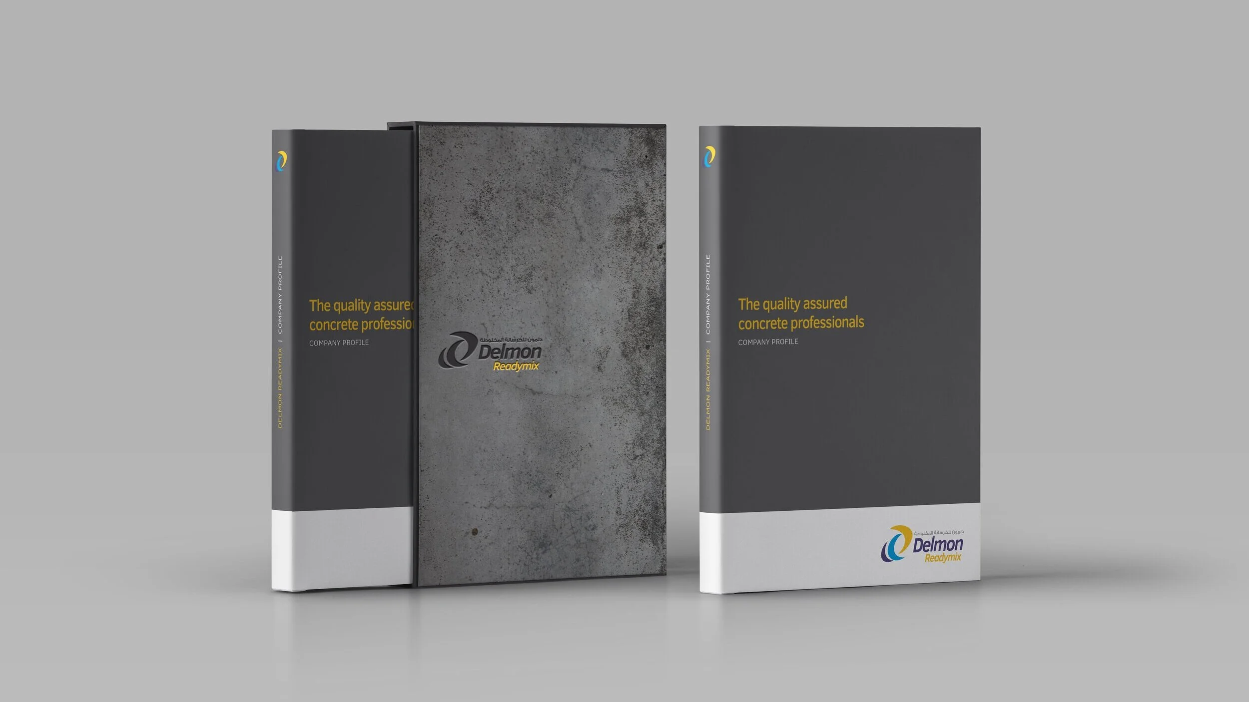
To refresh the Delmon branding. The client specified that they did not want to change the existing icon and colour palette however they wanted their clients to be able to clearly distinguish between the two sub-brands of Readymix and Precast. Their branding needed to reflect their impressive reputation in the construction sector.
OUR SOLUTION
Our first steps were to update typography, as well as to enhance and expand the existing colour palette. We used colour to distinguish Readymix and Precast from each other. Warm yellow for Readymix, representing the vigor and movement of the concrete mixing process. Cool blue to Precast, representing the rigid set concrete. By applying thorough guidelines such as this, we ensured a solid brand image and consistency across all platforms.